Monday, March 30, 2009

starlight ads in progress


I'm basically just going with the theme of these cars and the silhouettes. I still need to fine tune a few things, especially the type treatment on the screen.

These have inspired a sort of mini-specialty piece of a bumper sticker. It is still in the works, but it will incorporate these cars in a similar way but with some aspects from the stationery film strip thrown in.

Saturday, March 21, 2009

2 different directions... what do you think?


So, these are what I've come up with so far for Green Sprout. Just clean and simple. I do really like these, but for whatever reason I wanted to try something else completely different just to see.


I had some sort of statement here, but I think it is probably way too open to interpretation. I basically want to show that Green Sprout offers hot, filling, vegetarian meals disguised as meat and this in turn means 'eating green' in a whole new way.

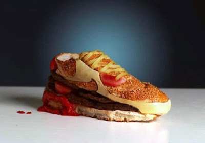
The green paint represents the idea of 'eating green' and the hamburger is something savory and filling. This ties back into the tag line 'green never tasted so good'. I don't know... I like the design, but I'm even starting to confuse MYSELF with this one... haha, I remember hearing we are designing for the simple-minded public, so I don't think this would really make sense to anyone. Especially since the place doesn't even sell hamburgers. I just wanted to represent a new way to think about vegetarian dining, and maybe turn non-vegetarian on to the restaurant and give it a sort of edge.

I showed my friend and he asked 'why would I want to eat a hamburger dipped in green paint?'. So, based on that, I think I'm going to scratch this idea. The first set seems like it's less to take in and is much more safe.

Thursday, March 19, 2009

ads that made me lol

This makes me laugh every time I look at it.


Simple, but clever.


Too funny! I like how they snuck in the logo.


Not really that funny, but it reminded me of something similar to what Cherisa wants to do for Walters (just not using food).


Retro logo. For whatever reason, this reminded me of Heath's pharmacy.


It's funny how times change. They could never use this ad today.

Thursday, March 12, 2009

my submissions for the JSE


Inner Beauty
cigarettes + glue
18x16x9


Death Stands Above Me
illustration
13x18


----------------------


I had thought about this one, but decided against it so I could have a graphic design piece included in my submission...

5 Figure Geisha
charcoal
27x36

FINAL green sprout stationery


Basically, all I changed was a few things on the business card and some small punctuation issues on the type.

Friday, March 6, 2009

any advice?


So... over the weekend I want to get this stationery behind me and start churning out ad ideas. I feel completely done with the other client, but I feel this one needs a few adjustments.

I am pretty happy with the envelope and letterhead....


My main concern is with the business card. My other one is playful and unusual so I am going for a clean sleek card. I'm just not sure about the design... I put the restaurant address on one side and the personal info on the other... I don't know... I feel it needs something...


Any comments and advice would be groovy.

FINAL starlight stationery


Made a few minor changes... probably not noticeable to anyone but myself.

One question... how does the return address look on the envelope? I'm wondering about the placement. I want to keep it in the upper left corner but I don't like the way it fits together with the logo... maybe I'll be different and move it to the back...